
Cloud Elements
api documentation redesignAbout the Project :
Four week internship (two week sprints)
Cross-functional team of four
My focus: competitive strategy, information architecture, visual design, user testing
Within weeks of receiving our final deliverables, Cloud Elements has updated their documentation site based on the team’s recommendations - https://docs.cloud-elements.com
Cloud Element’s existing API documentation does not provide an experience for users to access the content and guidance necessary to set up integrations in an efficient manner.
My team was tasked with tackling one of the less flashy, but essential, components of the business that had been largely overlooked - API documentation. Specifically, creating a documentation experience that would maximize the amount of progress a new user could achieve in the first 30 minutes, 60 minutes, and week of interacting with the product offering and documentation site.
Understanding the Product
Cloud elements is an API-based service with a catalog of over 150 pre-built connectors, or “Elements” that allow customers to set up integrations between software platforms that otherwise would not be able to communicate. There is an incredible amount of value that can be created through these connections and the embedded platform that supports the catalog, and each integration is unique.
Over the last seven years Cloud Elements has expanded to over 100 employees in several locations, and faces many of the same challenges that I’ve encountered working for other engineering-focused technology companies at similar stages of growth.
Getting up to speed
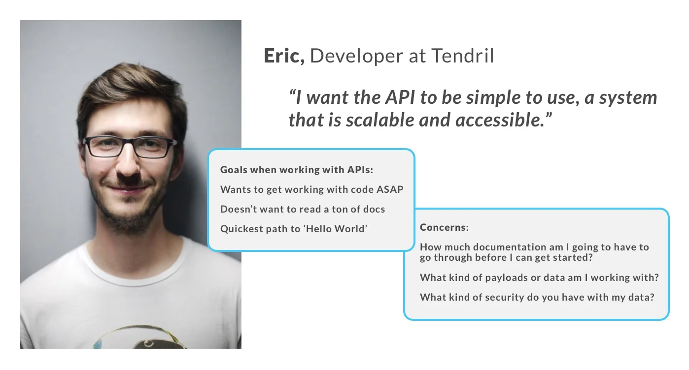
After spending a day in the shoes of “Eric the Developer” - a typical new user persona tasked with setting up his company’s first integration within the platform - we learned firsthand about the struggles of navigating documentation that lacked an intuitive information architecture.
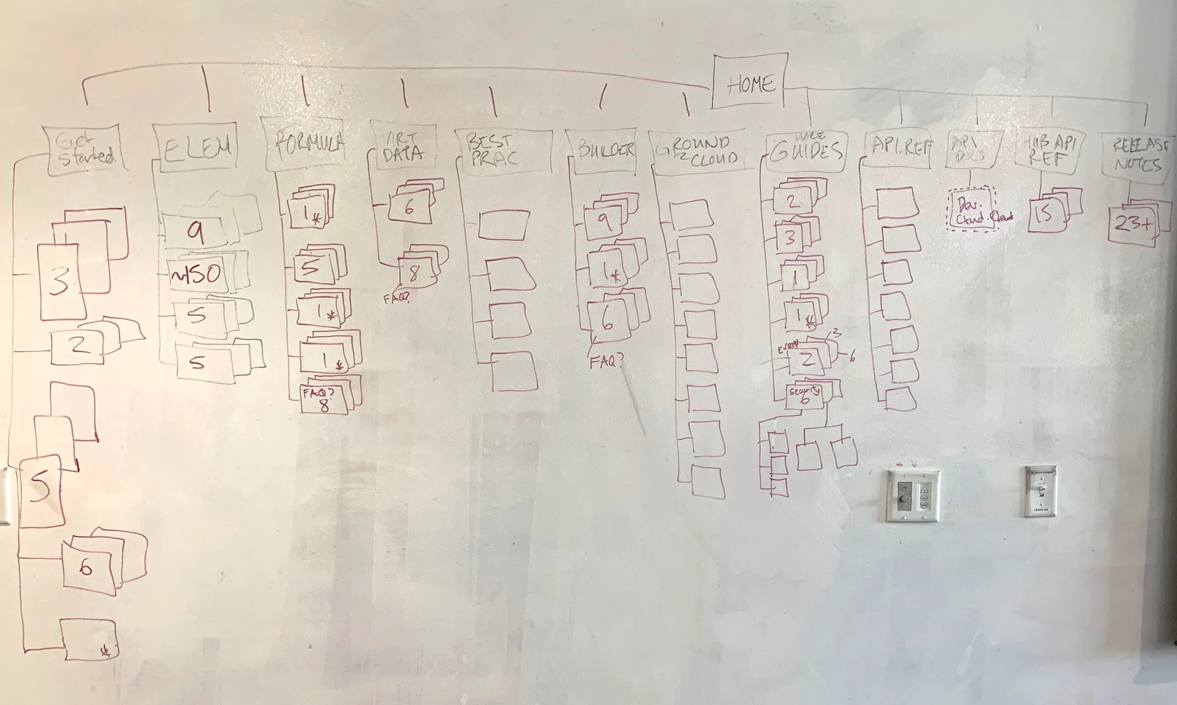
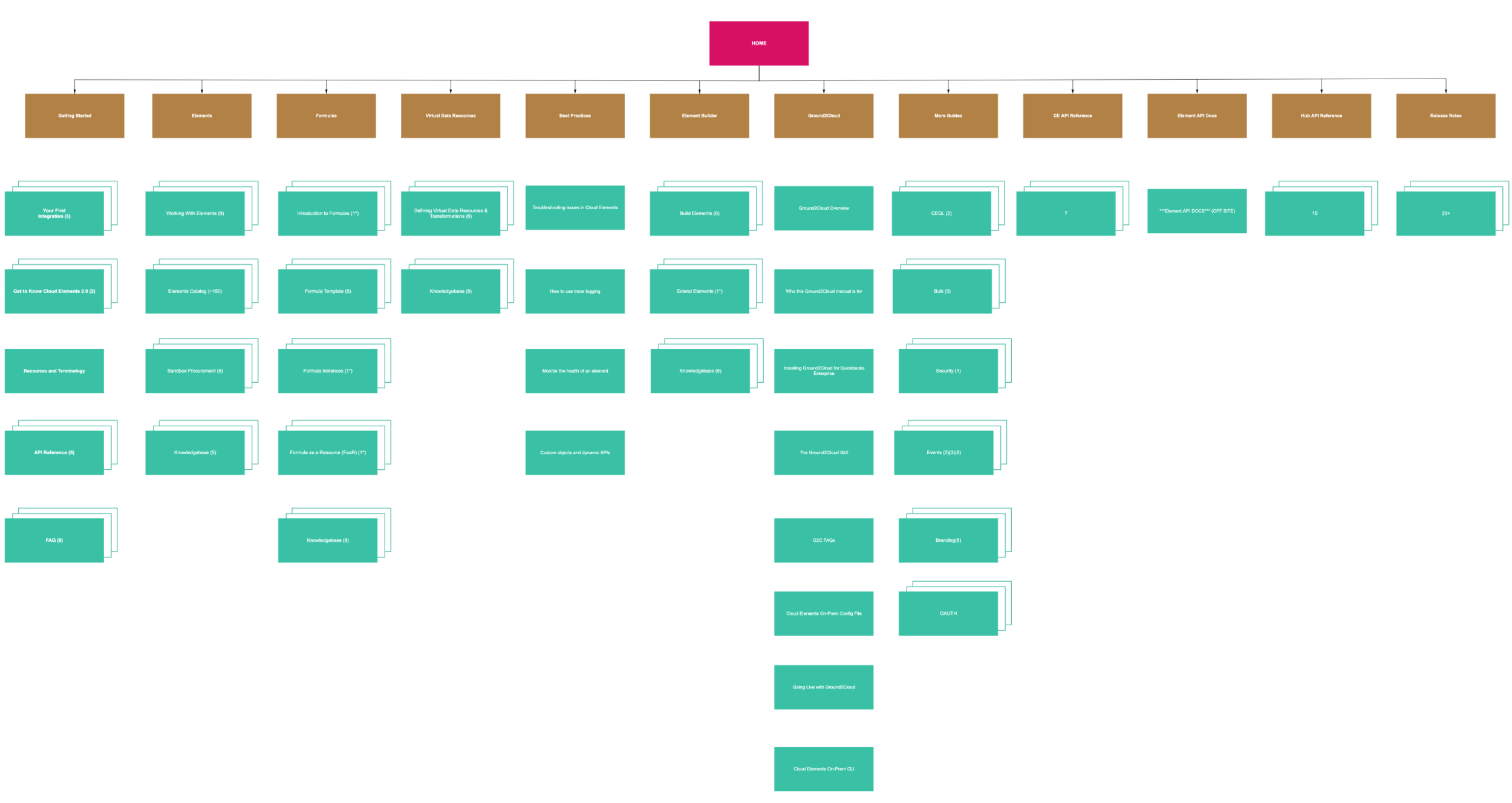
The team got to work conducting a heuristic evaluation and mapping the existing site’s layout. What we found was a general lack of consistency regarding the levels of navigation (anywhere from one to six, without any set pattern that we could uncover) and a global navigation that didn’t do a great job of prioritizing the essential topics that new and returning users would find most useful.
After getting familiar with the current state of the site we organized meetings with developers and sales engineers, gathering a wide variety of opinions and personal preferences to sift through. In the end these conversations uncovered three other high-level issues to resolve:
Instances where keyword search inputs may produce hundreds of possible results with varying levels of relevance - e.g. “Elements”.
No clear call to action on the landing page of the current documentation site to guide new users in the right direction for setting up their first integration.
Existing elements catalog layout with A-Z sorting only, limited to two apps per row.
Assessing the competitive landscape
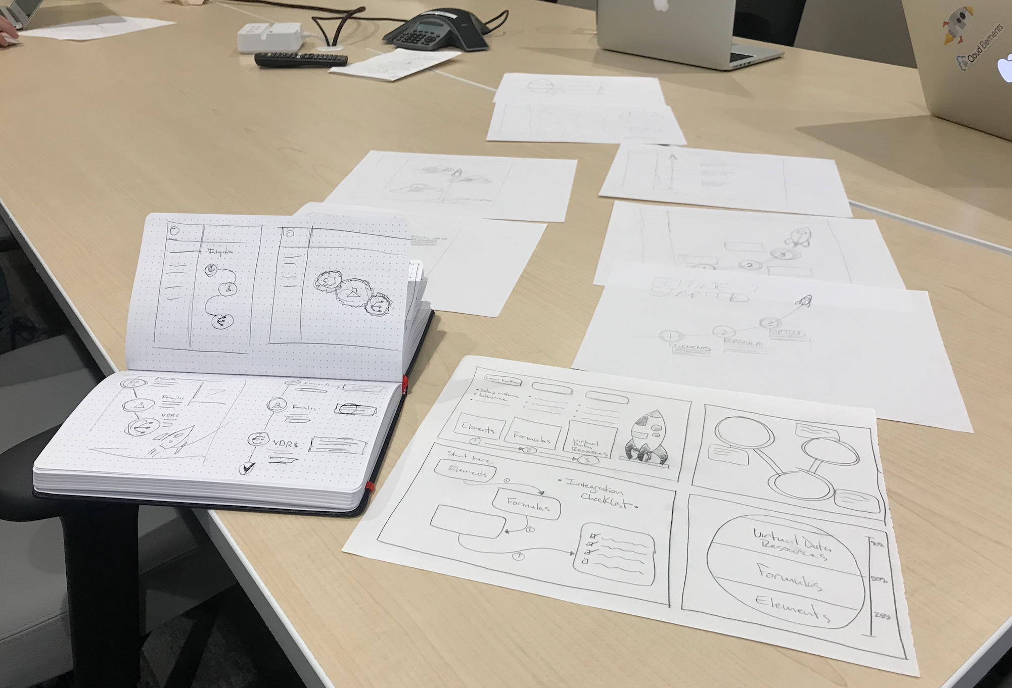
Collaborating on a shared RealtimeBoard was a huge asset to the team, allowing us to share screenshots of existing sites, highlighting delights/pain-points as a reference before creating our first lo-fi mockups.
The results of our competitive analysis and contextual inquiries enabled us move forward with buy-in from leadership on an initial approach to design and test.
Iterations evolved over time based on user feedback and later with some guidance from the existing Cloud Elements UI kit. A three column layout took shape with high-level navigation on the left side, and more granular references to page content within a specific topic visible on the right.
Early A/B testing of category sorting between the left and right navigation. In the end we determined that a simplified righthand column was best, allowing the user to understand their scroll position on the current page as well as view and navigate to all related content within the page at a glance.
We also tested a variety of visual queues. Feedback from users indicated a strong preference for using bold text to draw attention to key terms over color-highlighted backgrounds or underlining. This approach proved to be more effective and less likely to be confused for other signifiers, such as links to content.
Early mockups were created with left and right columns of equal width. Our final design incorporated an asymmetrical layout to reinforce navigational hierarchy on the wider lefthand side, and to create more space for expanding into sub-categories. A visual indicator of scroll position was leveraged next to the right column text.
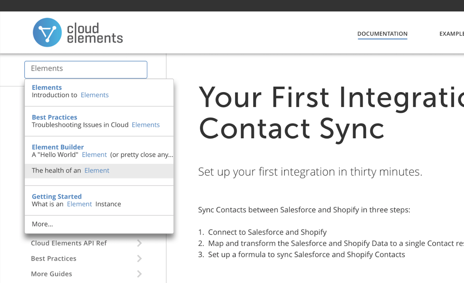
Search was addressed by creating a list of popular results for common topics. This solution divides results into multiple relevant options and provides the user with added context specific to where the keyword appears.
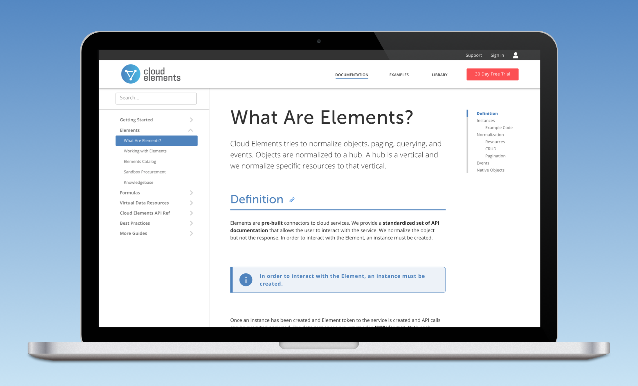
The final prototype leveraged color for navigation and the associated page content headers, and cleaned up H1 text and padding within the center column.
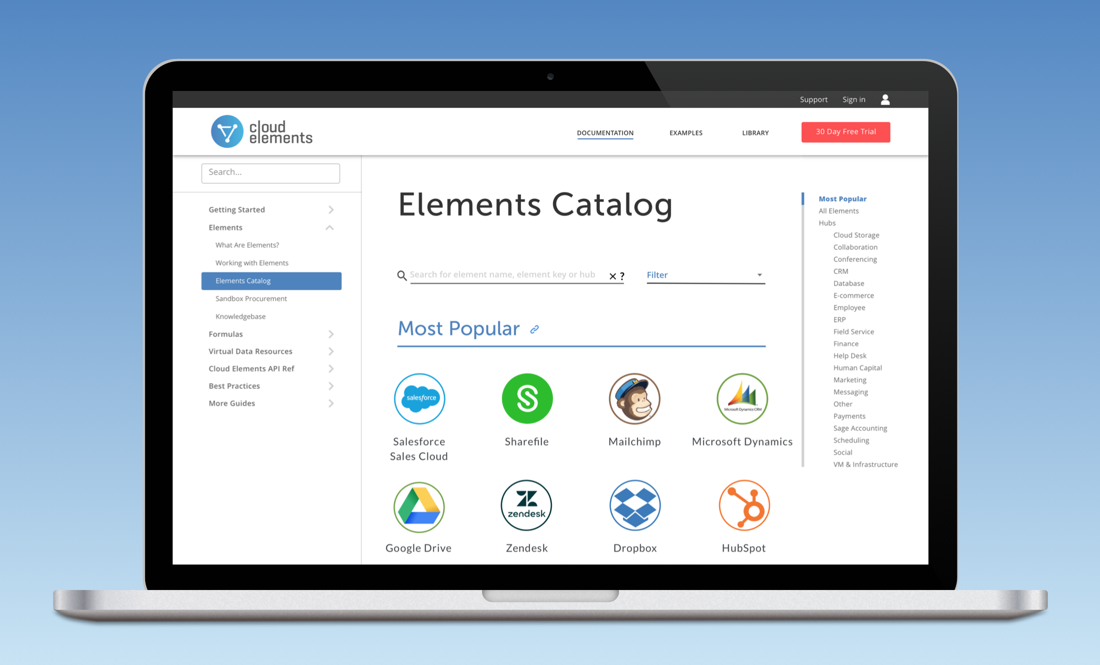
The element catalog was redesigned with a few common use cases in mind.
Most Popular - the majority of Cloud Element’s customers integrate with a small subset of the available connectors. We showcase the top sixteen to streamline the process for technical users and to catch the attention of prospects that may be casually browsing the site.
Hubs - visible in the righthand navigation column to align with a specific sales/marketing initiative.
Search - supporting the most likely action taken by a user focused on finding a specific element.
Landing Page Infographic
Conversations with stakeholders uncovered another business objective that we helped to address. Cloud Elements offering is divided into three central components: Elements, Formulas, and Virtual Data Resources.
In parallel with the work the team had committed to for the project, we conducted a design studio to generate designs that would serve as an indication that the three components were linked (and that a fully integrated customer would be leveraging all three).
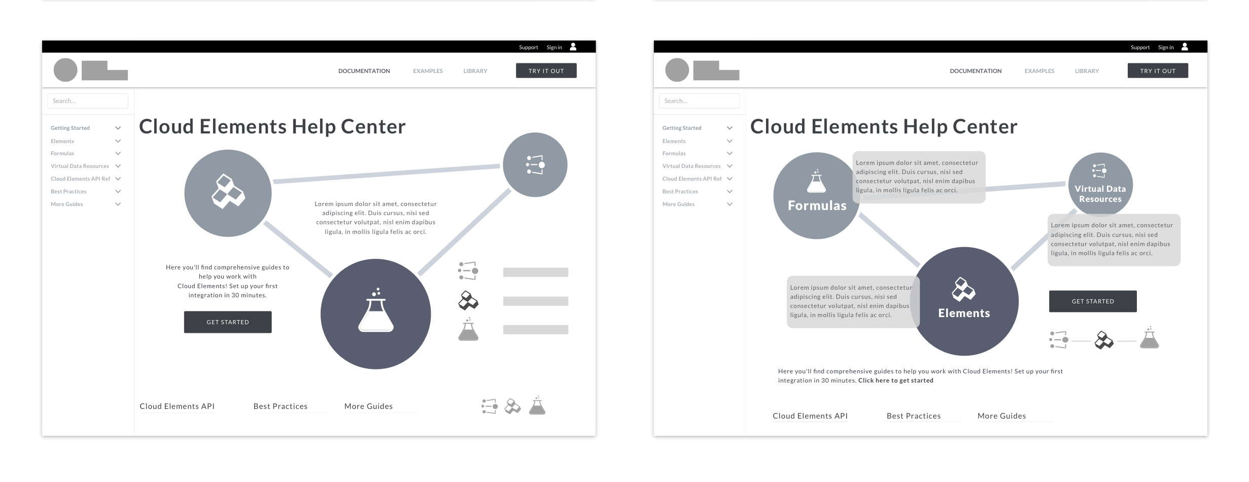
My sketch incorporating the Cloud Elements logo was pushed forward by the UX Director which led to several digital versions created by the team. Ultimately out of scope for the timeline that we were constrained by, this and other ideas were presented to the Cloud Elements team as recommended next steps during the final week of the project.
Homepage infographic and option for animation
Bookmarked and saved content features
Organization-wide sharing and social component for customers
Final Thoughts
Working within the constraints of a documentation site didn’t end up being as limiting as I had anticipated at the onset of the project. Focusing on the topic day after day gave me a greater appreciation for the level of detail and subtlety that goes into a great documentation site.
In many ways this project was an exercise in the core functions of user experience research and design, stripping away the distractions that often exist in more visually-focused efforts and getting to the core of creating a solution that served users while also benefiting the business.