NextHealth Technologies
components library, navigation redesign, program creation, materialUIThe Details :
Full-time 1099 contractor (September 2020 - March 2022)
First UX contributor after seven years of company operation / Product Design Lead
This role expanded the scope of my responsibilities as a designer and gave me the opportunity to build a design framework from scratch. I’m contractually limited in what I can share due to the nature of the industry but will cover high level frameworks and reasoning behind my approach below.
backstory
I initially joined the engineering team responsible for the migration from Angular to React codebase after months of developers attempting to navigate the rebuild without design input. The outputs created leading up to my arrival were in need of some serious attention - and particularly noticeable considering the legacy platform was also created without a hint of UX consideration. Aligned with a group of four developers and a dev lead, I was assured that ‘better whiteboard drawings’ was the extent of their needs and would go a long way to help steer things in the right direction.
initial assessment
In my first weeks on the team, I scheduled time with members of the team across all departments intending to create a list of high value items based on those conversation. Themes emerged and I created a prioritized list to review my team’s dev lead along with the product team.
Consistent UI patterns to replace bandaid fixes for one-off client/prospect requests (in several instances there the same functionality existed in multiple locations in the legacy platform)
Platform Navigation Redesign
Dashboard, charting library and rule builder integrations
Customer feature request backlog (ongoing)
addressing the platform ui
Highlighting the many pitfalls of the whiteboard sketch handoff to dev approach in the Angular platform, I made a case for standardizing on Figma and creating a components library to enhance consistency across the new platform, focusing on how this would also help to increase the velocity of the newly formed Denver-based React dev team.
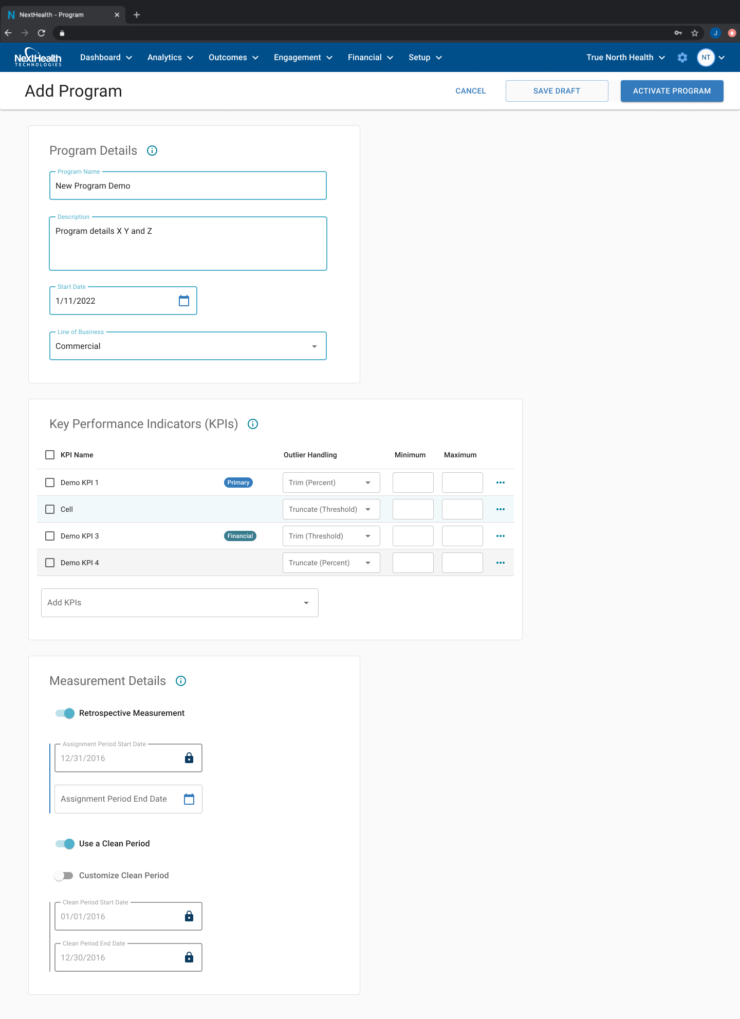
My approach was based on creating simple reusable patterns for the team to adopt. As soon as the general layout for my first large scale undertaking was defined, I began creating and testing medium fidelity mockups with a handful of engaged customers to better define the flow of the single scrolling form that would replace the multi-step wizard style modal that was creating the most issues for users on the legacy platform.
Legacy patterns like these were common and proved difficult to navigate - often preventing users from saving their place during multistep modals.
I mapped complex user flows and simplified when possible, which helped to highlight the cascading effects of user decisions higher in the form. This exercise created alignment as to the ordering of components within the form, leading to an intuitive flow within the form based on user testing.
With increasing momentum on the React team and better alignment cross-functionally with product team, I gathered support to adopt a MaterialUI components library to further increase dev velocity and integrate more flexible options for responsive tables and charts. I created a condensed version of the library as a style guide reference to increase familiarity within product and dev after making the shift.
navigating platform navigation
The overall layout of the legacy platform left much to be desired by our highly technical and savvy user base. Unexpected team turnover in the early part of 2021 left me working closely with c-level execs to determine priorities based on a long list of navigation improvements requested by users.
I advocated for a side navigation layout to compliment and simplify the basic top navigation that had created confusion across all user types in Angular. This lefthand panel resolved high priority issues and received positive feedback from the internal customer support team during initial testing. Depending on which aspect of the platform was being accessed, users benefited from an improved search experience, a jumping off point for creating new programs, and a simple option for adding paid modules.
A simplified version of the existing navigation served as an interim solution based on dev constraints and provided an opportunity for me to leverage the benefits of prototyping natively in Figma.
Hover states and dropdown menu orientation was specified in detail as a prototype to help developers understand constraints that may have otherwise been lost in the Jira ticket acceptance criteria. I also adopted an approach that I discovered in a particularly inspiring blog post to help guide developers with pixel-level layout guidelines which dramatically increased accuracy in QA.
You can check out this navigation prototype link to interact with the output created based on the project.
reusable patterns
As the team focused on setting up the initial structure of the scrolling form layout, I shifted my focus onto other aspects of the platform that had the potential to leverage similar patterns.
Programs, Goals, and Segments all related to a specific ecosystem within the platform so I reused the general MUI patterns in each case to cover the needs of the specific user flow while building familiarity with similar layouts in each case.
Dynamic tables were another focal point, allowing users to view critical data at a glance while also serving as a launching off point for adding and editing content related to the view.
Click through a simple flow between the goal creation form and the goal list view
As must-have features were delivered and QA tested, the need for additional actions - specifically the ability to save a draft version of a program - became apparent and were added to the design based on the initial patterns I created. Some refinement on button text was necessary to prevent confusion, standardizing on ‘Activate Program’ ‘Save Draft’ and ‘Cancel’ to provide more differentiation that the old Save and Activate/Cancel model.
The addition of an actions bar served to clean up old patterns (where buttons were often hidden at the bottom of a page) providing the user with constant visibility as to any actions available to be taken, regardless of scroll position on longer tasks.
closing thoughts
My time at the company highlighted the importance of effective communication within teams and across departments. This was my first experience onboarding into a new role in a fully remote work environment, and I also gained valuable experience working with teams of developers based on other continents.
I often relied on previous experience in order to sell the value of ideas that were worthwhile/necessary but impacted feature delivery dates - this was a constant balancing act between engineering and our broader business commitments. I always made an effort to consider both when presenting ideas to product-focused decision makers, and will be interested to see how the final product direction impacts the arc of the company’s success in the coming months and years.