Wowza Video
navigation redesign, platform merge, sales funnel optimizationThe Details :
Design Lead aligned within the product organization
Regular contributor to engineering, marketing and program management teams
Working at Wowza was my first opportunity to contribute to strategic planning in a full time design role, reporting directly to the VP of Product and meeting on a regular cadence with the CEO. My approach remained similar to past roles, advocating for agile best practices and facilitating open communication with product owners, content writers, engineers and marketers.
filling the funnel
As the only designer at an organization of over 150 employees, I was on my own to gather a sense of the landscape in my first days and weeks on the job. I always begin my journey with internal conversations across as many departments as are willing to speak with me. Patterns emerge from these conversations and in Wowza’s case, the priorities were consistent from team to team.
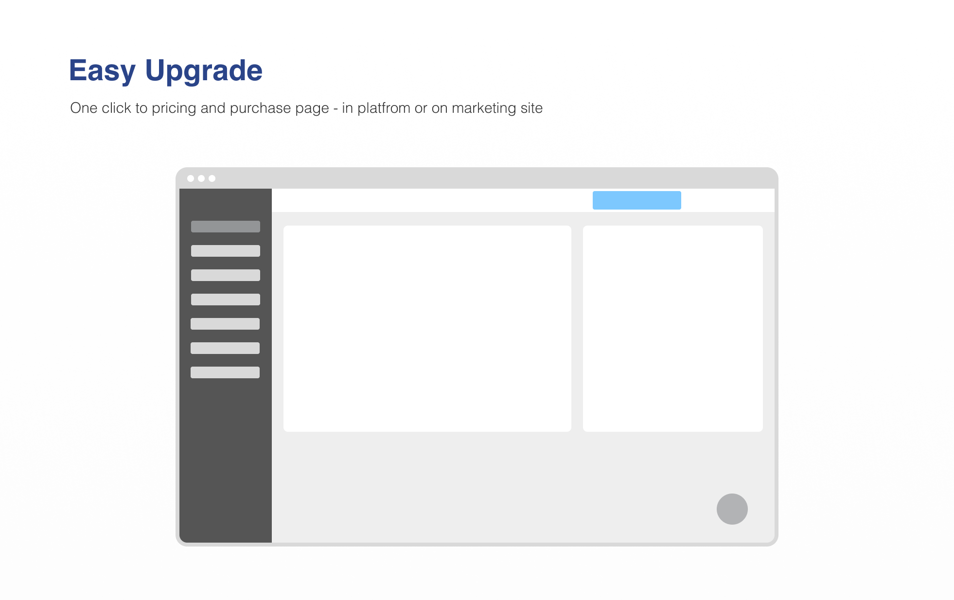
Increase sales funnel and subsequent conversions through and improved trial experience
Continue to refine an in flight UI redesign and product rebrand
Focus attention on improving an inefficient internal process for capturing product requirements
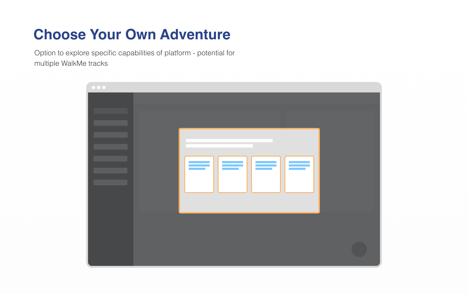
choose your own adventure
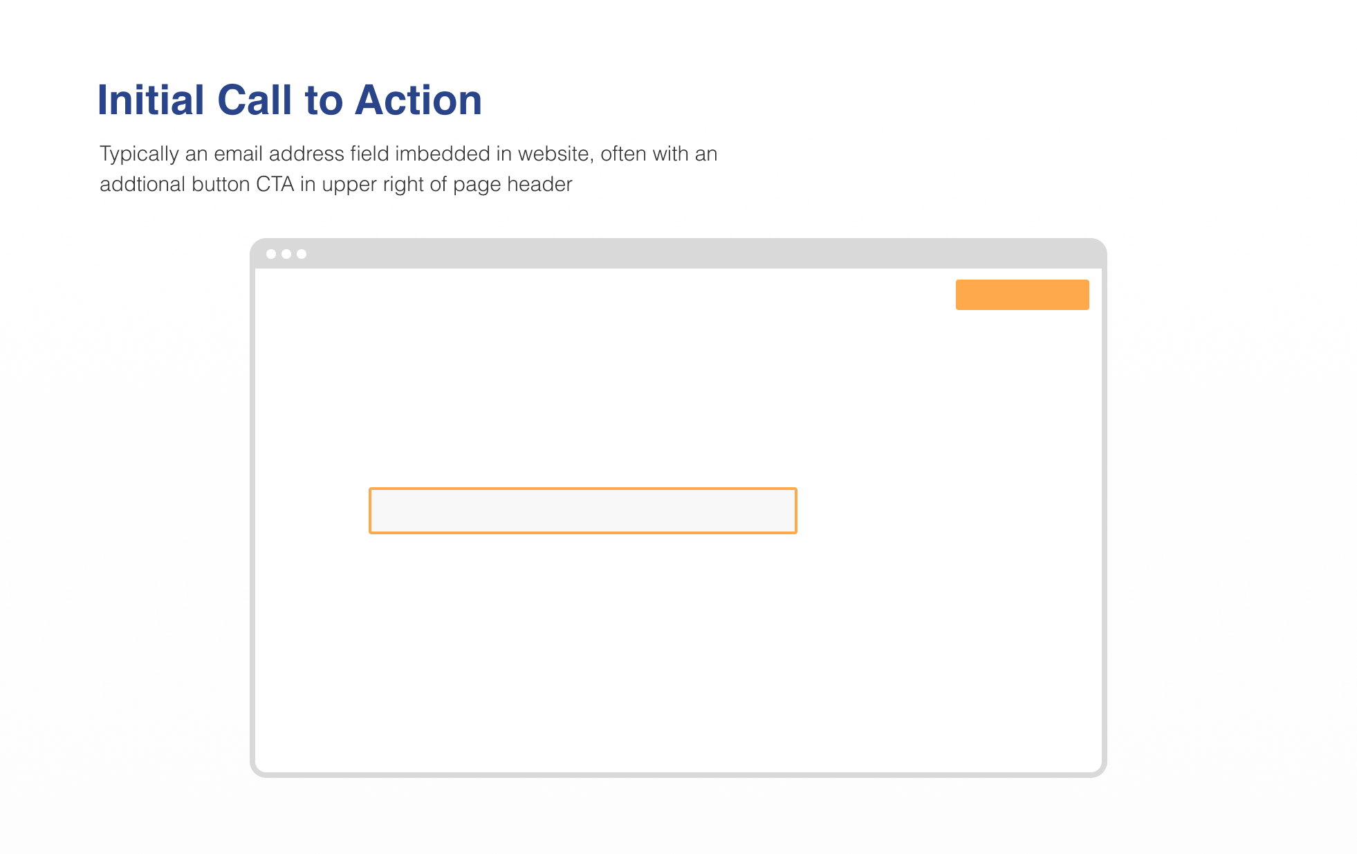
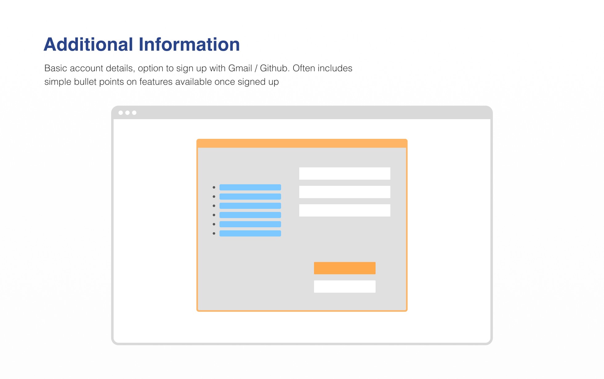
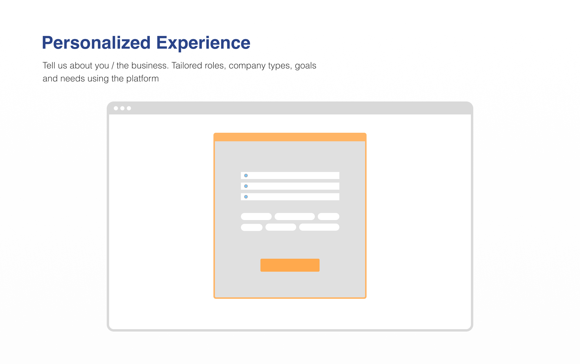
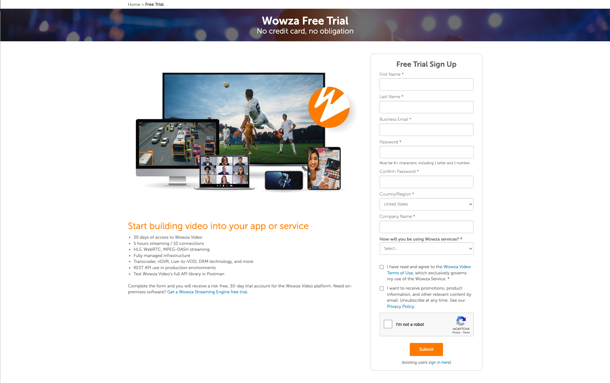
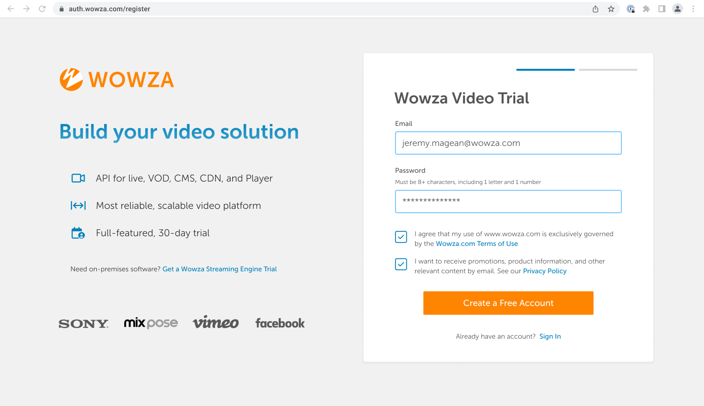
Out of date visuals and over complicated form fields were leading to abandonment during the trial signup experience. I advocated for uniform visual styling across the Wowza ecosystem, from the .com marketing site through the platform itself. Ideally each step helps to build familiarity, capture only the necessary data for proper support throughout the trial experience, and provide the appropriate level of guidance for a variety of trial user personas, from highly technical to first time live streamers.
I conducted a competitive analysis to gather data and inspiration from the current Saas landscape and created a generic trial flow to catalyze conversation between the product and marketing leaders. A two day onsite helped answer many questions but as often is the case, uncovered even more. Each question answered created 1-2 more items to explore, increasing scope of the project.

One newly discovered outcome of this meeting was the overall structure of our trial experience. Time based - historically a 30 day time box, loosely enforced by the sales team - vs credit based - great for educating new users on our billing structure and incentivizing action upon signup. Ultimately the technical implementation of a credit based trial exceeded the engineering team’s bandwidth, but conversations continued on the merits throughout my time at the company.
Next, I shifted my focus onto many initial updates intended to streamline and modernize the first impression created by the UI.
Before:
And after:
interfacing
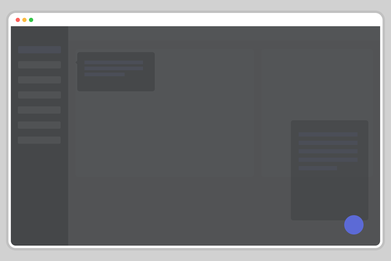
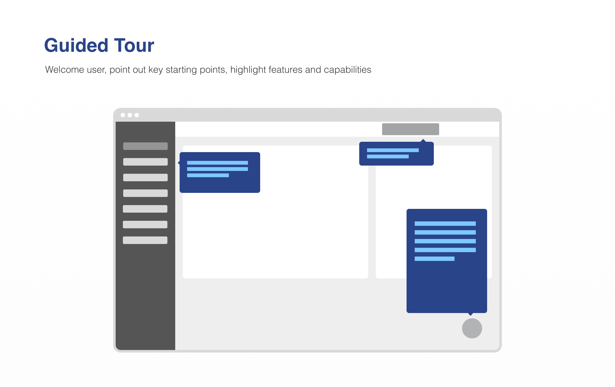
The visual redesign of the company’s main product offering, Wowza Video, was in progress before I joined the team. Similar to my experience in previous roles, I was given freedom to set up a basic design system in the tool of my choice so I imported a few legacy Sketch files worth salvaging into Figma and began iterating on the existing purchased template. Through conversations with the product team, there was not a strong affinity for the existing layouts, so I began creating a step by step pathway for improving usability without creating unnecessary friction for existing users.
Keeping the trial experience in mind as the highest priority, I created a solution that removed the confusion of the empty dashboard that was central to the previous flow’s home screen. Instead of a welcome experience that led users to a landing page containing blank charts and graphs that would only be valuable to experienced users after interacting with the platform, as set of prompts and getting started links combined with table overlays helped orient new users.
Before:
And after:
There was a wide range of low hanging fruit to address, which made for a notable morale boost on the product and sales teams early on.
Highlights included:
Increase contrast of the left hand navigation and simplify/differentiate the hierarchy of the items. Top level items are highlights that act as a subtle answer to the ‘What exactly does the platform do?’ question that trial users often find themselves asking.
Remove the Running as a Trial banner in favor of something a bit more modern.
Establish a visual hierarchy within the focused content panel. Basic design principles went a long way here, along with a cleanup of the top navigation and user information.
Useful ‘Getting Started’ content for users to reference, rather than being greeted by an empty dashboard. Acknowledgement of this status using overlays on widgets that would populate with relevant content once the user started streaming.
I also created intermediate targets to support a more iterative rollout of the improvements, creating a less jarring experience for users, and helping to parse out dev stories for the team internally.
cross functional communication
During my time at Wowza I stepped more formally into an aspect of design that extends beyond the typical hard skills that I’ve honed over the last five years. I’ve always seen team and cross-functional structure as part of the design equation. As the sole design advocate at a company this large, I was able to sit as an intermediary between all departments and connect the dots for increased communication and collaboration. I often found myself working with other department leads to work on making sense of complex and sometimes contentious dynamics left over from previous projects.
Sometimes just creating a simple graphic went a long way, other times interactive whiteboarding sessions that evolved into working documents and references for leadership were the final output. I was alway eager to take on the facilitator role when colleagues were in need of guidance, or just looking for a less rigid container to operate in a design-oriented mindset.
These examples organized and simplified thoughts, and most importantly in my opinion helped to catalyze conversations across teams. An evolving visual reference enabled a basis for shared clarity long term.
tracking progress
I’ve made an attempt with this summary to branch out a bit from some of the practical UX skills that are presented in my other case studies. My time at Wowza highlighted the importance of clearly defined goals and team alignment, from high level vision to tactical delivery. I enjoyed being included in strategic meetings and having a hands on role in defining the overall direction of the business, drawing from my years of experience in sales and properly structured agile environments.
As is the case with all departures, I had mixed feeling about the amount of value I was able to create during the time I spent with the team. Reflecting on strategies and practices is core to my process - what similar patterns arise and are shared among all teams, and what situations present themselves as opportunity for growth in the future. I’m interested to see the longer term trajectory of this particular group as they navigate a competitive and growing field, and track my own predictions and recommendations against the actual outcomes over time.